PROOVE 

Sheffield, Manchester & Leeds

LOGO + BRANDING + MARKETING

Our tasty relationship with Proove started at their pop-up street locations and we are delight to be part of their continuing journey, following through full branding as they opened restaurants in Sheffield, Manchester and Leeds.

We spent time with Proove getting to know the process, which even involved being a pizzaiolo for a few evenings! It soon became clear that the wood fired oven is at the heart of the business and we created a logo and identity around this. 

They called the restaurants Proove to emphasize that their dough is handmade and left to prove for extra flavour. The double ‘oo’ refers to the Italian double ’00’ flower used to make the dough.

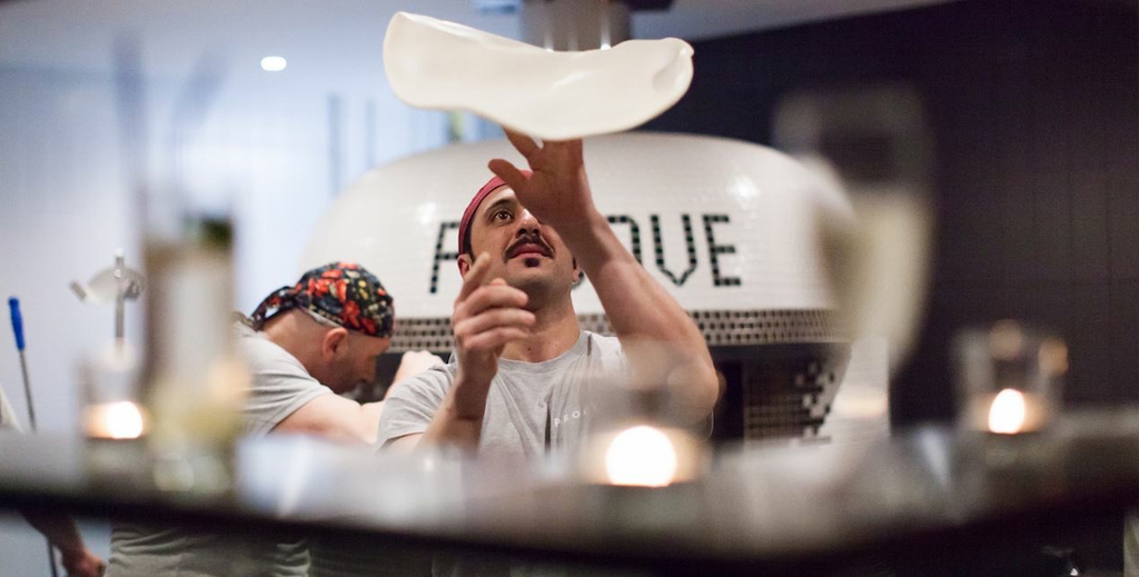
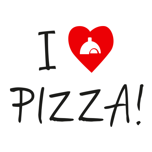
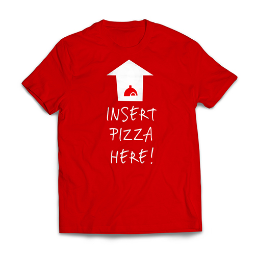
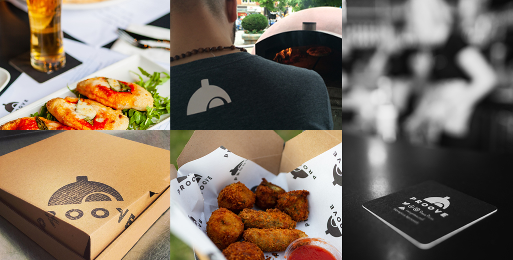
We drew an illustration that captured the unique features of this special oven that comes all the way from Naples. Then paired this very bold illustration with a clean and simple typeface to create their final logo.  

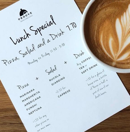
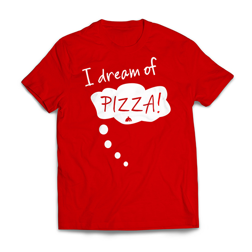
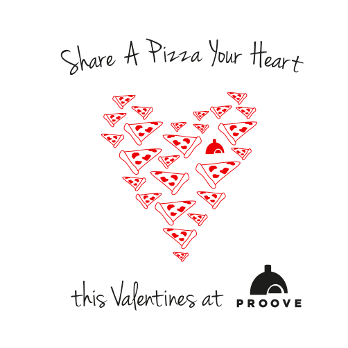
A handwritten type was chosen as part of the branding to add the handmade quality and a personal approach to the bold logo.

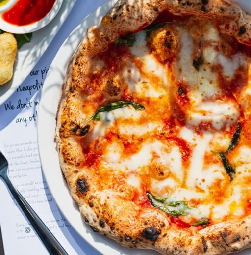
We introduced through branding to restaurant menus, adverts, banners, T-shirts and flyers for the pop-up sites and we’re are working on new designs and merchandising as the business grows.oduced the branding to restaurant menus, adverts, banners, T-shirts and flyers for the pop-up sites and we’re working on new designs and promotions as the business grows.

Previous Project

Next Project

© By The Sky Design 2021